Case study · Government / Sports
Rebranding Clean Sport for a Nation.
The challenge
Where we started.
The National Anti Doping Agency needed an identity that could stand on televised world stages, unite athletes, officials and campaigns under one visual language, and signal a modern, transparent institution. The existing identity was dated, inconsistent across departments, and invisible next to global sporting brands.
The full story
How it played out.
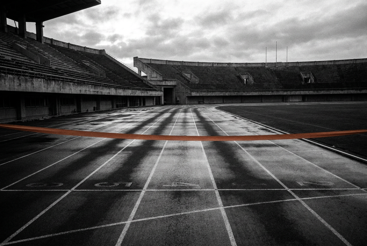
Government identities usually fail quietly: a dozen departments, a dozen vendors, a dozen versions of the logo. Our audit collected every artefact NADA touched, from dope-test certificates to stadium backdrops, and mapped where the identity leaked. The new system was designed backwards from its hardest moments: a broadcast lower-third at 6am, a certificate that must feel official, a campaign that must feel human.
Rollout was treated as a product launch, not a file handover. Department kits, vendor specs and usage guardrails shipped together, so the identity survives the one place most rebrands die: everyone else's hands.
What we did
The moves.
- 01
Identity audit across every touchpoint: certificates, kits, campaigns, digital properties and event stages.
- 02
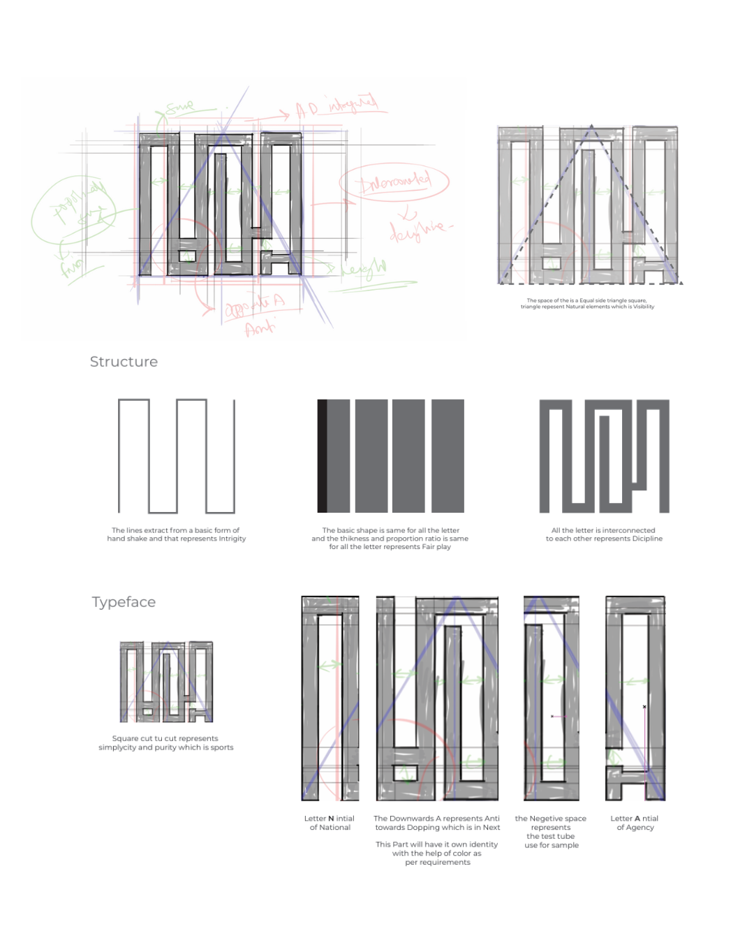
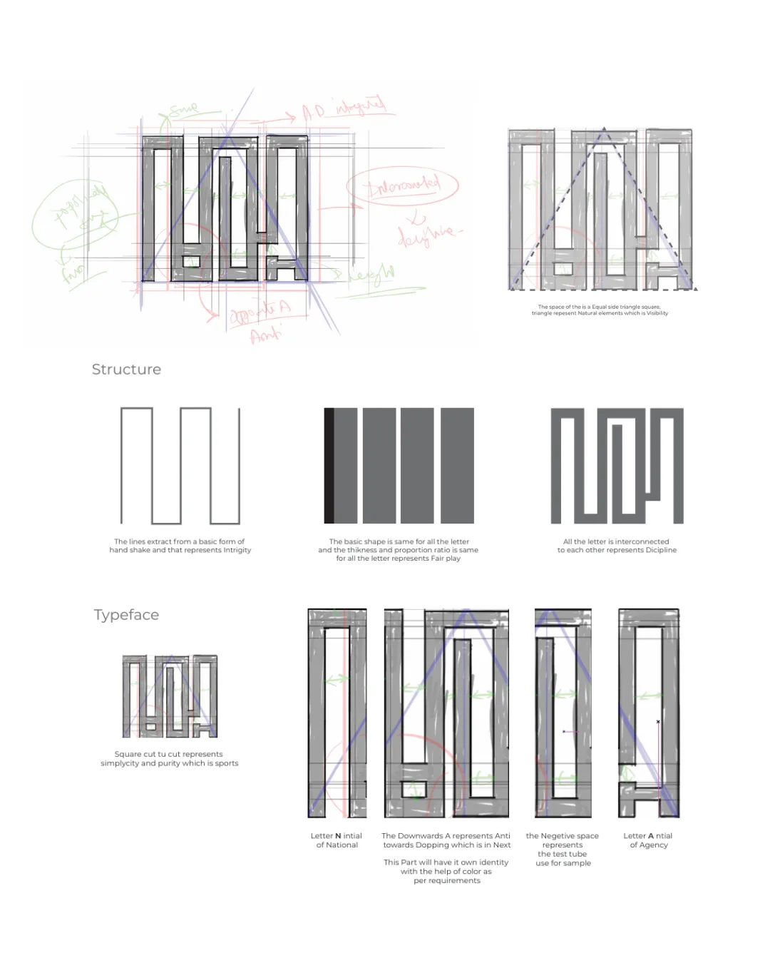
A new visual system built around clarity and fair play: refreshed mark, disciplined typography, and a colour system that holds up on broadcast.
- 03
Rollout kits and guidelines so every department, event partner and print vendor applies the identity the same way.
The results
From the project
"An identity that plays fair and looks the part on any stage."
Your turn
Want numbers like these?
One call. We map your gap and tell you honestly what we'd do first.
Start a project →